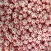
Food-grade silicone bracelet with gradient color matching
Basis for color selection
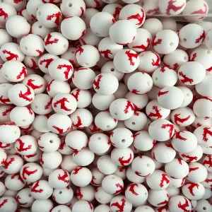
Based on the cultural implications of the Chinese zodiac
If the bracelet features zodiac patterns, the color selection can be in line with the cultural implications of the zodiac. For instance, the zodiac sign of the dragon often symbolizes nobility and auspiciousness. The gradient color can range from gold to orange-red. Gold represents nobility and wealth, while orange-red symbolizes auspiciousness and vitality. The combination of the two not only reflects the characteristics of the dragon but also creates a dynamic and magnificent visual experience through a gradient effect. The zodiac sign of the Goat gives people a sense of gentleness and purity. It is suitable to use a gradient from white to light blue. White symbolizes purity, and light blue brings a peaceful and soft atmosphere, which is in line with the image of the goat.
Consider the preferences of the target audience
The choice of colors will vary for people of different age groups and genders. For young women, a gradient from pink to purple is a good choice. Pink represents sweetness and tenderness, while purple symbolizes romance and elegance. This gradient color can satisfy women’s pursuit of beauty and showcase their softness and charm. Young men, on the other hand, may prefer a gradient from blue to green. Blue represents composure and rationality, while green symbolizes vitality and vigor. This combination not only aligns with a man’s temperament but also showcases a positive and upward spirit.
Combine with the popular trends
Pay attention to the current fashion trends and color schemes, and incorporate them into the gradient color combinations of your bracelets. For instance, in recent years, the Morandi color series has been very popular. This low-saturation color combination can create a high-end and elegant atmosphere. You can choose a gradient from light gray to light pink. Light gray gives people a sense of stability and restraint, while light pink adds a touch of tenderness and sweetness. This gradient color is both fashionable and versatile.
Gradient method design
Linear gradient
Linear gradient is the most common way, which transitions colors along a straight line. For example, from one end of the bracelet to the other, the color gradually transitions from bright yellow to deep orange. This gradient method is simple and clear, which can bring a strong visual impact and is suitable for highlighting the fashion and modernity of the bracelet. When worn in sports scenarios, a bracelet with a linear gradient can become a beautiful sight on the wrist, attracting others’ attention.
Radial gradient
Radial gradient is the diffusion of color in all directions with a central point as the reference. The center of the bracelet can be set to a bright red, and then gradually transition to a soft pink around it. This gradient method can create a sense of three-dimensionality and layering, making the bracelet look more vivid and interesting. In social occasions, radial gradient bracelets can showcase the unique personality and taste of the wearer.
Multicolor gradient
Multicolor gradient is the combination and transition of three or more colors. For instance, the gradient from blue to green and then to yellow, this gradient method is rich in color and diverse in variation, which can create a unique visual effect. Multi-color gradients can be designed based on different zodiac patterns or themes. For instance, for bracelets with an ocean theme, a gradient of blue, green and white can be adopted to simulate the color changes of the ocean, giving people a fresh and natural feeling.
Color matching skills
Adjacent color matching
Adjacent colors refer to the colors that are adjacent on the color wheel, and the transitions between them are relatively natural and harmonious. For example, red and orange, blue and green, etc. Gradient combinations of adjacent colors can create a soft and comfortable visual effect. Take the gradient from red to orange as an example. Red represents passion and vitality, while orange symbolizes warmth and sunshine. This gradient color is suitable for wearing in spring and summer, giving people a feeling full of vitality and vigor.
Complementary color matching
Complementary colors refer to colors that are opposite each other on the color wheel. The contrast between them is strong and can produce a distinct visual effect. For example, red and green, blue and orange, etc. When using complementary colors for gradient matching, it is important to control the proportion of colors and the softness of the transition. For instance, the gradient from blue to orange can be achieved by using blue as the main color and gradually transitioning to a small amount of orange. This way, it can not only highlight the contrast effect of complementary colors but also avoid being overly dazzling. This gradient color is suitable for wearing in occasions where individuality and a sense of fashion need to be highlighted.
Combination of cool and warm colors
Cool colors such as blue and green give people a sense of calmness and stability, while warm colors such as red and yellow give people a sense of warmth and enthusiasm. Combining warm and cool colors in a gradient can create a unique visual effect. For instance, it gradually transitions from the cool-toned blue to the warm-toned yellow. This gradient color combines the serenity of blue with the vitality of yellow, making it suitable for wearing in various occasions and showcasing the wearer’s diverse charm.
Adaptation to actual application scenarios
Daily leisure scenes
In daily leisure time, people pursue a sense of comfort and ease. You can choose soft and fresh gradient colors, such as a gradient from light blue to light green. This color combination can make people feel relaxed and happy, complementing casual clothing and a laid-back atmosphere. Whether it’s shopping, taking a walk or having a party with friends, wearing such a bracelet can add a touch of fashion and vitality.
Sports and fitness scene
When exercising and keeping fit, it is necessary to show vitality and dynamism. Therefore, bright and vivid gradient colors can be chosen, such as a gradient from orange to red. This kind of color can stimulate people’s enthusiasm for sports and make them more energetic during sports. Meanwhile, food-grade silicone bracelets are comfortable to wear and will not affect sports movements. The gradient colors can also become a highlight in sports equipment.
Formal business scenario
In formal business occasions, it is necessary to present a professional and steady image. You can choose low-key and steady gradient colors, such as a gradient from dark gray to black. This color combination is neither too flamboyant nor too showy, yet it can reflect the wearer’s taste and temperament. When paired with formal wear, it can add a touch of refinement and elegance to the overall look.

Leave a reply